Album – James Blunt Back to Bedlam
I have done this to see what I have got to do to make my own. The digipack is more work than I thought it would be as it has more elements than I originally thought. In addition, I have done this to see what works and what sort of techniques I can use in my own text.
Why I chose this text?
I chose this text as it is a similar genre to my choice of music and I think will have similar target audience. The album cover is the same thing that I want to do with the bright colours and quirky fonts used. I think it is young and appeal to me and I really want to make something like this, to this standard.
I chose this text as it is a similar genre to my choice of music and I think will have similar target audience. The album cover is the same thing that I want to do with the bright colours and quirky fonts used. I think it is young and appeal to me and I really want to make something like this, to this standard.
FRONT…

There are many images that have been chosen for this album cover, but the dominate image is of the artist ‘James Blunt’. It is just of his face but it has been framed so that he is over the left side of the cover with a quarter of his face covered. Also, it is in a cartoon like style with just the outline of the face and facial showing through the background. The angle of his face is straight towards the camera, looking slightly up. The other images used are in cartoon from and only a filled in image is shown. They are all images of fun and random things and animals, going with the title ‘back to bedlam’ as it’s very crazy and doesn’t really make sense.
The font chosen is ‘Broadway’ I think this is a very modern and cool looking font that would appeal to the younger part of his target audience. The colours of the Album cover are mainly blue, but it does fade from bright blue at the bottom to light blue. The colours of predominate image is navy blue that does made to a lighter blue. The little cartoon images in a pale yellow and as they go up towards to main image it fades to orange. There 2 bits of text are ‘James Blunt’ and ‘back to bedlam’ the James Blunt is in a dark red and the other text below it is in white, all the colours link.

Choice of Image… etc.
This is very much linked to the front and the images chosen are in the same style as the front the cartoon and block colour images that look quite modern and young. The font is the same as the front with the title of the album.
However, the list of songs has a variety of different and weird fonts again linking to the title of the album. The colours are the same as the front with the blues and the white faded pattern in the background. The layout is pretty centre and is quite informal as it is so crazy and random so is more informal.

This is still linking to the front and the side with the blue, the font, the colours, and the background pattern. These things making the whole digipack look convincing and will help to make it successful.

Choice of Image… etc.
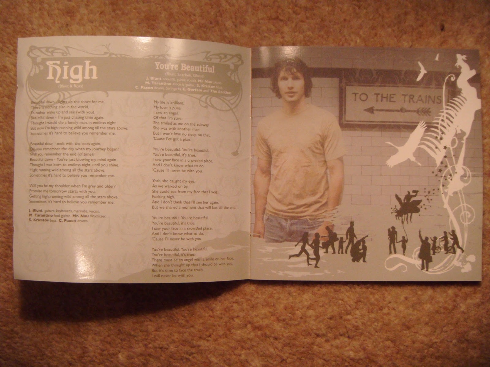
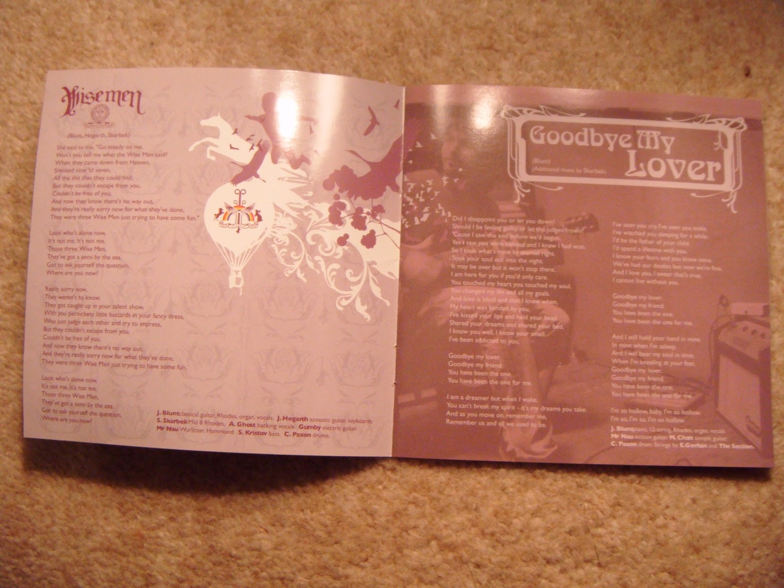
The inside of the digipack of this album has chosen the same theme, there are more images of the artist, but this time they are not in cartoon style they are clear images but are made to look faded and I think have used sepia to make them look older. Also throughout the booklet there are the mini cartoons, but every page is a different colour scheme and the cartoons change colour according to the page. This is also the same with the titles of the songs and the font they have used it changes on every page so it is very random and messy looking. I think this makes it look young and like a rebel. In addition, this is more informal looking and defiantly more for younger people. They have cropped the images of the artist that he is never totally, all his body in the shot it is mainly mid shots.
THE CD...

Choice of Image... etc.
The CD is still linked but is more contrasting as it is mainly all a dark red the same as some of the font on the front but I bit darker. The image on it is a pill, split in the middle half white and half green. There is also the same title of the artist and album on it with the same font and colours. The pill on the CD makes you think that the bedlam of his life is getting too much and people take pills and things like that to get away from the craziness of normal life. The pill is not totally centred it is like it has just been placed there and is diagonal. The title is very centred and just above the hole in the middle.
Who is the Target Audience?
I think the target audience for this digipack is young male and female aged 16-30 (young adults). I think that this digipack will appeal to the target audience as it has the young vibrant colours, and cool, quirky font.
Representation
I think that James Blunt is represented as a young and free spirit that can do what he likes. His life and personality are seen to be crazy and very random, but also fun. In addition, he is seen as laid back from the inside cover you can see this. He is ether looking relaxed or sat down with his guitar. All around just a relaxed, young and fun guy.
digipack and it can make the target audience or break the target audience. Also, it made me realise that the album is a great way to represent and sell the artist and how they are; this is because sometimes the music videos don't have the artist in.
I have used some of the thing that James Blunt has used such as Images on the artist just plain and simple stood there but I have developed this my having continuity of the artist stood behind where some of the locations are in the music video.
Image shown below of my CD placement and how I have used the artist shot and then made it with the stunning location.


No comments:
Post a Comment