Thursday 29 December 2011

Props - characters props

THE PROPS:

This shows the reasons and what props that I have chosen to put in my music video. This will help me to see if I need more props and what functions they have in my music video.

The Photos


These are the photos that the female character finds around all the settings in an certain order (see on previous post). I did this to show what the props were and explain on why I have chosen these.

I have chosen these photos as they tell a story of a girls life. There are more photos to be added of the 2 parents and then they will fade into black. These photos are there to show the story and link with the meaning of the song 'skinny love'.

This has made me learn that all the little parts that make up my music video so matter and will contribute to the over all look of my text. With the guitar I have stuck to the traditional music video genre of this song and put it in the video it is an obvious prop but then the pictures make it unique and personal level that other people can relate to.

I haven't really used many props in my music video, as the main props are so significant and personal there was not need for any other props. Also, another prop used the guitar is more an essaical as the song is an acoustic song so it made sense for the artist to be playing an scoustic guitar in the music video.

Actors Profile: About them...

Female Character:

I have done this to show what the actors look like in my music video and why I have chosen them. This also shows how they are a part and play a part in making the whole music video.


Why I chose this character?

- She is attractive
- looks fun and interesting
- Wear modern and cute clothes
- Will appeal to the audience

This is the female character in my music video this is person that I have chosen, she is young and pretty and will appeal to the younger audiences, and wears modern but pretty clothes that also go along with the genre of the song. I really think that this goes along with the target audience as she is the same as them and will relate to them.

This character is seen in my music video as the feature character walking around finding the photos of her life and leading up to the divorce 'Skinny Love' of her parents.

Male Artist of the Song - Singer


Why I chose this character?

- He plays the guitar
- He is attractive
- He looks like the artist and voice fits him
- He is male to go with the real male artist

This is the character that I have chosen to by the artist featured in the video. I have seen he play in a local band and is the exact thing that I want for my music video.

Also, I think that he will be featured in the video at random intervals to break up the same old look for a picture find a picture routine. I really think this will make the video seem real as practically every music video always has the artist in it at some point, so this will make my music video seem convincing.

I have learnt from this that the look and the little parts like what actors I chose will all play a part in the success of my music video. All the little parts, done correctly will make my music video hopefully look really good.

Setting Board

SETTINGS Board - Why I Chose them?

I did this to show what the settings are... This shows each different setting and a description of the the settings and why I chose them. Also what went well and what could have been improved on. This has helped me to decide on the order of the settings and how each will lead onto each other in the music video.

This has also been done to explain what the seasons are and what setting the season is in the setting. Also, this is showing the locations that have been chosen not only to be used in the music video but in the ancillary tasks to.

Woods...   


This is the setting for the first part of the music video with the girl going through the woods. I chose this setting as it is very stunning setting and the light was very good with the interesting shadows through the trees and the different tones of green and blues in the woods. This was also a pretty easy to get access to as it is the woods at the back of my house. I chose this setting as it was a stunning setting and all of the trees made for some interesting shot with the light coming through the trees onto the character face and highlighting her ginger hair.


These are some of tones and shadows that I have mentioned with the light beaming through the trees really made the filming look good and with the contrast of the greens against the ginger of my actresses hair really worked well. I chose this setting as the light is shown in it to be very pretty and this also highlights that it is summer time in the video.  


This is the location that I used for the first filming session. I think that this worked well as it was a good day for weather and the sun beaming through the tress made the lighting look very beautiful and natural. All the colours of the greens worked will against the contrast of character and her clothes, making her look isolated.

took this photo as I wanted to show the more nature side of the video. The whole video will be filming in stunning natural or man made places, with beautiful features and things around my character while she is going on her journey. This all linking to Mise-en-scene as this flower and all the stuff around.

Beach...


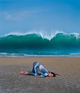
The 2nd setting is Big bury Beach, I think this is the most impressive setting as it is just truly beautiful with the different with the grass in the background and the sea and the sand. This was a good setting with the light as well it was so bright and I was lucky enough to get a really bright and sunny day. I chose this setting as as I think that it is truly stunning and show that the artist is showing that he is the west country artist and where he is in the country and the locations.  


The image that I took above are of the natural beauty of the location that I choose to film. I chose to film here as it likes to the song and the idea of the music video. This was done as test and might be used in my final music video. I think this will appeal to the audience as the places are very pretty and look like a place that the audience would want to visit.


This shows the location and how I used the water and the waves to my advantage in the filming as I have a bit of my music video where I show the waves lapping the shore and have my actress walk through the water in bare feet. The overall effect of the water, waves and sand made it look very real and like a real Media text.


This is where I choose to film another part of my music video for my first filming session. I choose this location for many reasons. My audience research on slicethepie.com responses showed that they thought that location was important in any music video as they said for a music video that the location should link with the tone of the song. For example a pop song someone suggested that I should have a funfair. This linking the upbeat nature of the song as well as location. I really think I have linked the tone of the song to the location.

Moors...


This is the third setting of the music video... This is Dartmoor, this is on my doorstep so it was an easy location to get to and is really beautiful. Also, I think it links well to the other setting but is still different in its own way. The only issue that I could have had with the setting is the weather but luckily there was a lovely day and I was able to get some successful filming done.


This shows the tree that I used to the have the photo on in the music video. In addition, this shows the vivid blue and the greens on the moors. The lighting was very good as well as it was a bright day.

House...

The Outside...


This is the house used in the final stage of my music video, this is a simple Victorian terrace in a cute rural village. I used this as it looks really sweet and the inside with the big bay windows is very light. As well as this, it looks like a traditional simple family home. I chose this setting to end the video as it kind of ends the journey at a final destination for the character and it looks like a a normal family home and ties the whole story together and shows a closure for the artist.


This shows the front door that the girl character will walk through to end her journey and this shows that the times and weather had changed as the reef on the door shows that it is Christmas and the season has changed. I really like this as it simple but still has a personal touch with the isle of man sign next to the door.


The Inside...


In all these photos of the inside they link well to the outside as it is the same house and it is quite cute and quirky but still with the family feel to it. I also chose this house as it is easy to get access to as it is my house and it is very light and bright so the lighting was not an issue... you can see this in one of the images with the big bay windows shining in lots of light. 

Studio - White Screen...


This is the white screen that I will be using to have my artist in front of with the pictures of the family behind him. This will break up the same old look for a picture find it think and give a bit of variety in the music video and I am showing the artist. I think this worked well when I put it in black and white and added the footage and shows that I have thought about it and have made it link with the ancillary tasks. 

This has helped me learn to get the right setting for the music video and the genre of the song and how the audience research showed that beautiful setting are a must to go with the song.

I really like the locations that I chose and think they really make my music video. It really links everything together with the ancillary tasks and the magazine adverts. It is a theme all over my project and shows I have thought about mise-en-scene and everything around this to make my music video as successful as I can.

In addition, I really think the locations are important as I chose them for specific reasons and they make continuity throughout the project. They are the locations around where I live and where I grew up and my story to place so this meaning I have stuck to my story and how personal it is.

Tuesday 20 December 2011

Back of the Album Cover - The Process


Why I made these decision?


I learnt from this that it is a long process to create something like this due to the manipulation of changing the original image made this a long process. As well as this, I learnt that it is very hard to got one image and to cut around it.

I really like the out come of this and by this time I was very confident on editing programmes so I could a lot more and make images look really different from the original image. This process was mainly the same with all the other ancillary talks but the back cover was by far the most complex as it had the most things to go on it like... The track list, bar code, website, record label which is copyright to Island Records. The effect that I have created I think looks good and is the most professional looking part of my whole album.

1st & 2nd Attempt - Inside Cover CD


I did not chose this as my CD placement in the end as I thought there were not enough images of the artist so I thought that this would be better to use the side of this image as the side of the album as I liked the look of the wood and the natural look goes with the continuity of the setting of the music video.

I really do like the look of this but then I decided that the album would look better if the entire inside was in black and white or sepia. I think this looks good as on the front cover I have been able to inject a lot of colour so the front cover really is eye catching.

3rd Attempt - Album Cover


Storm Thorogson:


This image inspired me to create this album cover as it is just something as simple as a pretty setting and something quirky really makes the image impressive to look at and eye catching.
I have added this little person falling as you can see, I have done this as I am inspired by Storm Thorogsons work and his artwork. I really think taking a picture of a beautiful setting and then there being something a little off about it, a little quirky edge
really worked well.

I chose not to use the black and white images for my front cover as I thought the whole album in black and white would have made it look quite plain and seemed to look boring. With the injection of colour on the front album cover I really think it is eye catching and shows the fun personality of the artist and looks visually interesting.

The colour one also allowed for me to show off the setting more and the little man falling looks more convincing on the colour one. The black and white images I do like but I think they hurt peoples eyes when they look at it as the contrast has been turned up so high so this making them not look at the artist name of the name of the album.

2nd Attempt - Album Cover


This is the 2nd thing attempt of my album cover and in the end part of this image became the sides of my album. I did like the black and white but again this was almost to easy to create and I think that most people would think it to plain and its not the most interesting thing to look at so I think it look amateurish. I chose not to use this as it isn't the best look and shows that I haven't made an effort to properly manipulate an image or try and replicate some of Storm's ideas.


1st Attempt: Album Cover

I did this to show what I am hoping to achieve and that I have stuck to the conventions of an acoustic music video. This showing to the audience that my song and video is mainstream and should hopefully make it more successful.

I have learnt from this that at this point in the my project that I am not very confident with photo shop and other editing site I was only able to change the colour and add text which doesn't show much still with the editing so this first attempt was unsuccessful as I think it looks unprofessional, I don't like the text that I have chosen or the colours I have out them in and think it doesn't look convincing and jut looks boring.


Tuesday 13 December 2011

Front Album Cover - Inspiration

Storm Thorgerson - Images

These are images created as album covers by Storm Thorgerson, a creative artist and album maker. These are the sort of things that I want to create with the edgy but with beautiful natural background with one main focus of ether something in nature or a person/animal. These images have inspired me to create something of a similar standard so it can challenge me with photo shop and I think will give me a strong front cover of my album.

IMAGE 1:

This image is one of my favourites of Storm's work I really like the composition of the piece and how there are two vocal points the natural/manipulated items (the butterfly) and the two people pointing up and looking at it. I would love to be able to create something as good as this with the stunning backdrop.
 IMAGE 2:

This image is one of another place that is very beautiful location. I like the focus on the one man in the picture and am looking to do something similar on my album cover but with one girl in the background with something in the for ground that has been changed and looking out of the ordinary.
IMAGE 3:

This is what I was wanted to achieve with the thing in the background with something around it and the thing in the for ground with something odd and unreal about it. This is the main image that is the inspiration behind the idea.

IMAGE 4:

This is a very interesting image with the wave in the background and the girl in the for ground this is the same sort of attractive girl that I want to use in my image but she would be standing and in the background. I like the colours in this image as well with the contrast between the blues and the natural browns and the skin of the girl.


What my idea is for my Final Album Cover...

- I want to use a natural stunning location (moors)

- An attractive girl in the background holding a balloon. (to link with back cover)

- Something in the foreground that has been manipulated by photo shop to look unreal and inspiring.

I learnt from this that I do find Storm's work is really inspring and I really like his work I think that I have replicated his work, espically with my front cover with the stunning location and the little quirky touch of the man falling off the plant.

Image Below shows MY Album Cover...
This is what I have done for the front of my album cover. It shows that I have used the same sort of look as Storm with the stunning location, with the little twist with the little man falling.


I have learnt from researching Storm's work that you don't always need the artist to feature on the front and if you make the album cover look very weird and stylised people will be interested in it and it will become successful.