Ideas Video!
This shows the Video that I created that has my ruff ideas about my Music video and the song 'Skinny Love'...
Storyboard - Music Video Ideas from Bethany Neave on Vimeo.
The Idea for my Music Video...
I did this to show what my ideas are for my music video. The idea that I have had is a single character walking around in different/beautiful places and finding pictures of her life and her mother and fathers lives. The whole point is that she is revisiting memory's and looking back at them, all of them leading up to the divorce of her mother and father e.g. the song called Skinny Love. The video I want to end on a positive note with her with all the pictures and being happy with who she is.
I learnt from this that I really do like my idea and I think it will be affective and I will be able to achieve it. After creating this is allowed me to develop my ideas future this was just the orginal ruff ideas that then allowed to me look back at them and see where they would take me. I learnt from doing this as well how to use stop motion Pro V7 and how to make a storyboard.
By doing this storyboard I was also able to show that I had thought about it in the planning stages and then had gone out and got the footage and from the music video that I created I have acutally stuck to the orginal idea but it is clearly in a lot more detail now with more shots but this shows that my orginoal idea for the song 'Skinny Love' has worked out.
Wednesday, 26 October 2011
Sunday, 9 October 2011
Filming Sessions - How they went?
1ST FILMING SESSION...
I did this to show how mu first filming session went and what problems I came across and then sorted some things went well and other didn't... for example there is part of the music video where the character is actually a different girl due to the other actress being away.

The problem that I had with the beach shot was that I couldn't get the same character as the first wood shoot. I overcame this problem by filming the other characters feet and their back so it looks the same. The costume that I put this character in was a pretty light blue flowery dress, sunglasses and bare feet. I think that this costume links well with the location and the beach scene.
The bare feet gives the character a care free and relaxed feel to her and the natural just got out the sea hair still goes along with the location. Over all I really like how this has turned out.
The first filming session when very well in the woods I got some good footage with the element of the good weather and stunning scenery it was very easy to get some affective shots. I managed to use a range of different camera angles and did things from still shots to my character moving through the woods.
2ND FILMING SESSION...

This was the woods filming session I think this went well as I got some interesting shots with the character behind and the sun coming through the trees.
The only problem I had on this photo shoot was getting into the woods as they are at the back of my house and are rather overgrown by our gate so we had to child so this was the only trouble that I had.
3RD FILMING SESSION...

This was the 3rd filming session and this was the filming session that I did on the moors and outside around my house and the local area.
I chose this setting as it was very easy to get to and is a stunning setting to film with the mixture of oranges and greens.
This filming session went okay as I didn't have my character will my I had to be in the film but only film my feet and me from a distance so that you can't tell the different or change in character. Another issue that came up was that when I placed the photo on the tree (seen in my film) I had a real problem as it was windy and it wouldn't stay where I wanted it.
Other than this this filming session was a success and I was able to get all the footage that I wanted will some interesting shots of her feet and match on actions of going behind the tree.
4TH FILMING SESSION:

This was a spur of the moment filming session as I was travelling with my sister (the actress in my film) to visit family and I noticed this effect it has when she looked in the window and I happened to have the video camera with me.
This wasn't a planned filming session but I really like the overall effect of this footage. I also got some plain shots just of the outside on the train.
The only issue that I came across on this was when I filmed directly into the window you could see the camera in the reflexion. I over came this by filming at an angle as you can see from the screen grab from my music video above.
5TH FILMING SESSION...

This is the final filming session that I did for my music video. I have used this house as it is my house so was easy to locate and get to. Also, I have done this because of the big bay windows of the Victorian house this allowed for plenty of light to make the the footage look good.
The only problem that I have with doing this in this house was that with some camera angles I wanted to get there was furniture in the way and I couldn't get them without making the camera wobbly.
Over all, this session went well and I got some good shots of my character and the final end shot I am very happy with. Also, the mise-en-scene goes very well as it is a family home and suits the character that I have used.

This is the first time that I tyred to the idea out of finding the pictures and it worked really well and I have now used it throughout my music video.
This is linking to the idea of my whole music video. The idea is for my character to be going on a journey and visiting new and beautiful places and on the way finding different photos along the way of her life and her parents past life. This is one of the photos are her parents wedding. I have done this as it is still in a good location and it gives my video a storyline. The idea goes along with the song 'skinny love' in my eyes this means that the love is fragile and could break at any moment; this is linked as the characters parents divorced. This linking the location, song and storyline of the music video.
For the filming throughout my music video I have mainly used hand held shots to get the personal view through the characters eyes and to really get the point of the song and video across to the audience.
This has made me plan ahead for my other filming shots so that I do not get the same sort of problems such as uneven ground and characters being away. I think that this really helped me get a feeling for filming and it has seen my ideas come to life and see which ones work and which ones don't.
I learnt from doing this that I can overcome problems that I have and that it can work to change things and if my media text is going to be successful I need to be willing to change and adapt to certain problems. I also learnt that the location of the shoots really is important for my music video as it looks really affective on my footage.
Friday, 7 October 2011
Audience Targeting - Profile
Audience Profile
Age: 16-30
Gender: The song is gender neutral but the video is more aimed at women.
Personality: Thoughtful, deep, romantic and adventurous.
Interests: Travelling or seeing new/beautiful places and discovering themselves.
Social economic group: A, B, C1
I have learnt from doing this what my specific audience is and what I need to be aiming for in my final media text.
How I made this choice?
I came to this conclusion of the target audience from taking information from my audience research and looking at current music videos of the same genre. The song that I have chosen has also influenced my audience as I feel that me and my friends are in the target audience, as I liked and chose the song. After deciding the idea for my music video, I feel that the girl featured is very relatable so this therefore meaning that the target audience is similar to her in age and personality. This all helping me to decide on the audience profile.
Wednesday, 5 October 2011
Case Study - Taveran Todorov
 Tzveran Todorov - Narrative Theory
I did this to look at a different vue on the media and what theory he has come up with. I am also doing this to see if his theory can help me in my own media text. I also thought that it would be good to have more than one theroist on my blog and the ideas that he has come up with, linking them to music videos.
What are the key points of his ‘narrative theory’?
What are the key points of his ‘narrative theory’?
The way that stories and characters are seen in media texts
5 keys ideas…
1. Equilibrium – Normal life/balance
2. Disruption – Normality is disrupted
3. Realisation – Characters accept disruption
4. Reparation – Fixing the disruption
5. New equilibrium – balance, but different
Example – The Hangover
1. Equilibrium: There is a group of male friends all going to a stag do for there friend in Las Vegas
2. Disruption: They have a night out and wake up not remembering anything.
3. Realisation: They realise that the groom is missing and they need to find him.
4. Reparation: All the humorous things they do to try and find the groom around Las Vegas
5. New equilibrium: They find the groom, get him back on time and he gets married.
Why is this important in studying media?
This is important as I can decide in my own media text whether to use his theory in my music video. I think that it does apply to some music videos such as Jason Durulo, what if. However, I do think that this can mainly be applied to film.
How can you apply his theory to your research/project?
I can appeal this it my research by looking at some example of music videos with his theory and seeing if I want to make I similar one or not.
I have learnt from doing this that I will not be using he theory in my media text as I don't think it really appeals to the type of genre. I did think about it but there is just not enough time in the music video or a strong enough idea to make his theory evident in my text.
This theorist may have some good ideas but there is not really any way in which I can link it to my music video I have a story but it does not fit into the things that he says it should. Therefore, concluding that it is not relevant to music videos as much but defiantly to films.
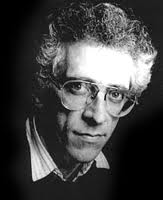
Case Study - Laura Mulvey
 Laura Mulvey - The Male Gaze
- Laura Mulvey is a British feminist film theorist
- She is a professor of film and media at Berkbeck
- Age 70
I did this so that I could have another person view on how people and especially women are represented in texts. I have also done this to see if her theory is true and if I can use it in my text.
What is the male gaze?
In film, the male gaze occurs when the audience is put into the perspective of a heterosexual man. A scene may linger on the curves of a woman's body, for instance. Mulvey argues that in mainstream cinema, the male gaze typically takes precedence over the female gaze. The women is then lusted over or seen as less dominant to men in a patriarchal way. It is the way that the camera is used to look at women in film.
Example – Love Actually Film
Man is writing a book woman brings him tea and then the book flies off when she removes the other cup. She runs down to get it and then takes off her clothes and dives in to get the pages of the book. Then the man goes in afterwards. The woman as she is taking off her clothes and it is put in slow motion and the camera pans up and down her body and lingers on her bum and other assets. Also, she does a graceful dive into the lake and the camera does a full body shot. This is sexualized and makes the women seen as more of an object.
Example - Music Video Rhianna Rude Boy
Thought out this whole music video it is evident that the male gaze is being used. we can see this from the outfits the artist is wearing e.g. skin tight and very sexy outfits. As well as this the camera is always focusing on parts of her body such as bum and breasts as she is dancing around. The camera angles used and the camera shots are very much seen through heterosexual male eyes and are the male gaze.
 This shows the artist (female) wearing a very small outfit that shows off her bum and by standing with her back to the camera it shows her bum. By having the image of her like this 5 times it makes the camera angle and the way the camera is panning slightly in and out shows how the male gaze is in action.
 This shows a close up on the artist mouth the way she is growing would suggest to the man that she wants him. The desire and animal like way she has her mouth and the CU really gets the feeling of the man looking at her with desire.

Why is this important in studying media?
It is important to look at this while studying media is that there are lots of different ways in looking at a text not just through feminism. However, Laura Mulvey’s work is quite important as it is everywhere and one of the predominate features in the media. Feminism is important today as in films there is a way to manipulate people into thinking a certain thing for women is the norm and this is done though films and the media as a whole.
How will this help me and will I use it in my text?
This will come in useful as I can look at her theory and choose if I want to use her theory to my advantage to represent the woman in a certain way to the audience. By looking at her theory I will be able to use it or make sure that I don’t use it to manipulate the audience to make them feel a certain way about a character or put across the genre. I think that I will use this in my own text as I have a single girl in my music video, who is very attractive I will not use it in the sexual appeal but more the beautiful way e.g. focusing the camera on her facial features and how pretty she is.
I have not used this in my music video as I think the meaning of the song 'Skinny Love' and the story that I have told within it there is no need for the male gaze as the female character in it is confronting her feelings on the divorce of her parents (a very serious matter and if the male gaze were to occur, it would seem wrong and not in keeping with the serious tone of the song and video content.
This has helped me in understanding how different people and different genders are represented to the audiences in media texts. In addition, it has made me see that the way the camera is used is key to manipulate the audience into feeling certain ways or be appealed to the text.
In addition, this has also made it clear to me that I am not using this in my film, yes I do have an attractive young female with camera shots of her walking and the back of her and close ups of her face but the song and the message within does not require the male gaze and I don't think at any point in my video I have used it.
Textual Analysis - WP
Textual Analysis - Web page
In the end I decided to create a music magazine instead of a web page, as I have had previous experiences with designing web pages and using programmes such as 'Dreamweaver' I am not confident enough to create a whole artist web page.
In addition, after creating my digi pack album, I have found I am a lot more confident in using site such as 'photoshop' and 'picnik' to manipulate images so this is why I have chosen to so a magazine advert as it has similarities on how it created that the album pack such as editing images.
I did this so I could see what a real media web page would look like for a similar artist as mine with similar music videos. This will help me when designing and making my own one. I really think this is the same sort of web page that I want to create.
Things that I can use on the Magazine Advert...
The convention that are used on this web page I can transfer onto the music magazine that will help me in constructing it. The image below shows what you see when you first look at the web page when it loads. This things that I will take and put on the magazine advert are the big bold font that says the artist name and the use of other fonts around the page. I will also use images of the artist but different to the web page I will use one dominate image of the artist to show that it is him and that this is his album. (only one image needed). I will also put information about where to get the album from other sites, this seen below in the form of hyperlinks.

In the image below this shows pictures of previous albums and images of the artist. I think the only think that I can take from this is I am going put I am image of the current album as that is what the magazine ad is trying to sell. I will not use the linear effect as I think I need a more informal look for the magazine to show off the quirky and interesting personality of the artist.

The image below shoes the second half of the web page when you scroll down. The only thing that I would use in the use of different fonts all over the page.

The things that I am going to include on MY web page...
- Multi-media, the use of hyperlinks, video, text and images.
- Lots of images of the artist in different situations, making the genre of music clear to the audience.
- Interactivity with other hyperlinks and videos.
- I would use more colours and different and bright fonts and images.
I learnt from this what are the elements I need to make my own web page. I think that I can take some of the things that have been used on this web page and use them on mine. I think by doing this is have got the conventions sorted so now know. (see above on what I have learnt).
Tuesday, 4 October 2011
Textual Analysis - DA
Textual Analysis – Digipack for Album
I have done this to see what I have got to do to make my own. The digipack is more work than I thought it would be as it has more elements than I originally thought. In addition, I have done this to see what works and what sort of techniques I can use in my own text.

Choice of Image… etc. BACK… 
SIDE… 
Choice of font INSIDE BOOKLET… 


Choice of Image… etc.


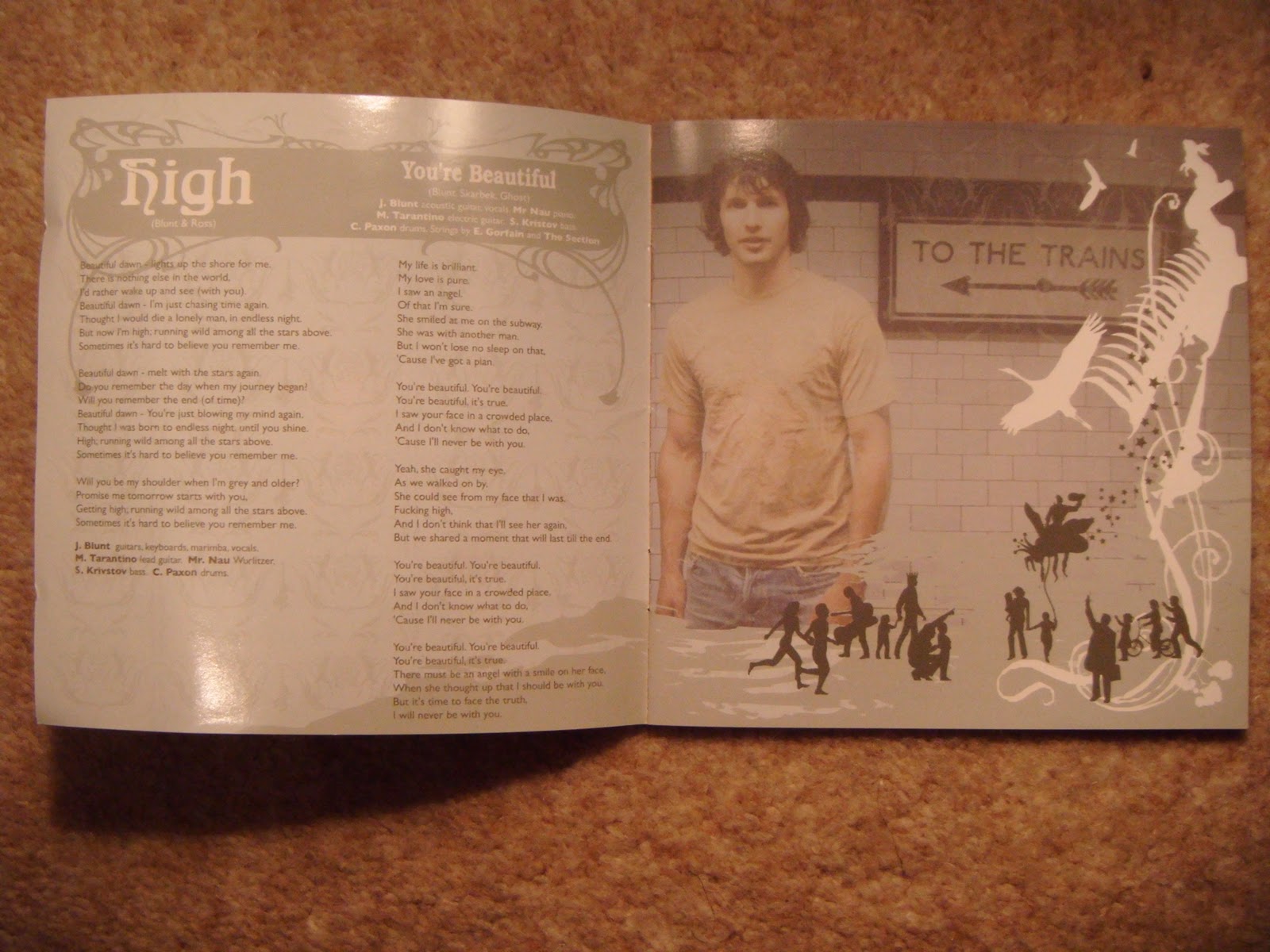
I really like the outcome on this part of my digi pack and analysing this digi pack really helped me in getting the professional look that I needed. Taking some features from this album shows that I haven't just copied I have thought and then developed them to make them my own individual digi back. I have also added on the rest of the digi pack my own little quirky edge that is quite like the idea that James blunt has used with the little cartoon around and all over his album in the 2nd image above is the front of the album and shows the little man falling which is taken from inspiration from this album cover and the album covers of Storm Thorogson (see more info on Storm on another slide).
Album – James Blunt Back to Bedlam
I have done this to see what I have got to do to make my own. The digipack is more work than I thought it would be as it has more elements than I originally thought. In addition, I have done this to see what works and what sort of techniques I can use in my own text.
Why I chose this text?
I chose this text as it is a similar genre to my choice of music and I think will have similar target audience. The album cover is the same thing that I want to do with the bright colours and quirky fonts used. I think it is young and appeal to me and I really want to make something like this, to this standard.
I chose this text as it is a similar genre to my choice of music and I think will have similar target audience. The album cover is the same thing that I want to do with the bright colours and quirky fonts used. I think it is young and appeal to me and I really want to make something like this, to this standard.
FRONT…

There are many images that have been chosen for this album cover, but the dominate image is of the artist ‘James Blunt’. It is just of his face but it has been framed so that he is over the left side of the cover with a quarter of his face covered. Also, it is in a cartoon like style with just the outline of the face and facial showing through the background. The angle of his face is straight towards the camera, looking slightly up. The other images used are in cartoon from and only a filled in image is shown. They are all images of fun and random things and animals, going with the title ‘back to bedlam’ as it’s very crazy and doesn’t really make sense.
The font chosen is ‘Broadway’ I think this is a very modern and cool looking font that would appeal to the younger part of his target audience. The colours of the Album cover are mainly blue, but it does fade from bright blue at the bottom to light blue. The colours of predominate image is navy blue that does made to a lighter blue. The little cartoon images in a pale yellow and as they go up towards to main image it fades to orange. There 2 bits of text are ‘James Blunt’ and ‘back to bedlam’ the James Blunt is in a dark red and the other text below it is in white, all the colours link.

Choice of Image… etc.
This is very much linked to the front and the images chosen are in the same style as the front the cartoon and block colour images that look quite modern and young. The font is the same as the front with the title of the album.
However, the list of songs has a variety of different and weird fonts again linking to the title of the album. The colours are the same as the front with the blues and the white faded pattern in the background. The layout is pretty centre and is quite informal as it is so crazy and random so is more informal.

This is still linking to the front and the side with the blue, the font, the colours, and the background pattern. These things making the whole digipack look convincing and will help to make it successful.
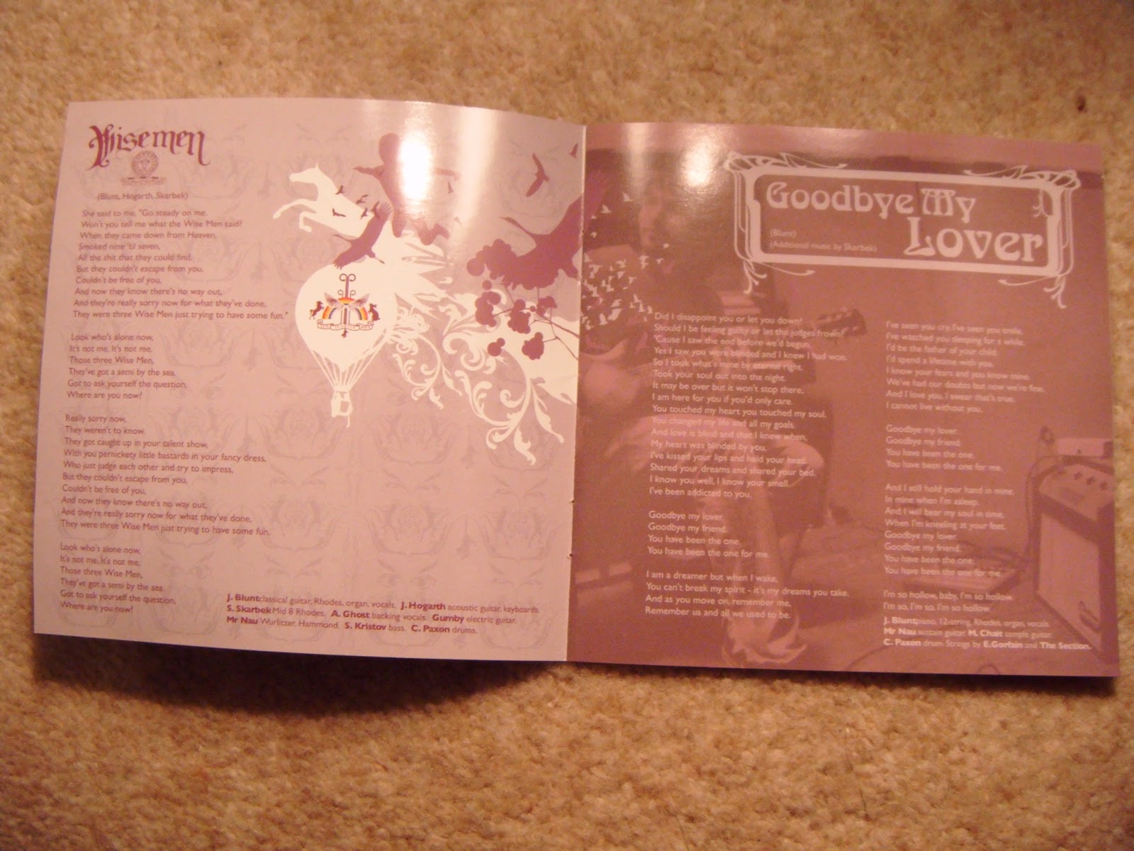

Choice of Image… etc.
The inside of the digipack of this album has chosen the same theme, there are more images of the artist, but this time they are not in cartoon style they are clear images but are made to look faded and I think have used sepia to make them look older. Also throughout the booklet there are the mini cartoons, but every page is a different colour scheme and the cartoons change colour according to the page. This is also the same with the titles of the songs and the font they have used it changes on every page so it is very random and messy looking. I think this makes it look young and like a rebel. In addition, this is more informal looking and defiantly more for younger people. They have cropped the images of the artist that he is never totally, all his body in the shot it is mainly mid shots.
THE CD...

Choice of Image... etc.
The CD is still linked but is more contrasting as it is mainly all a dark red the same as some of the font on the front but I bit darker. The image on it is a pill, split in the middle half white and half green. There is also the same title of the artist and album on it with the same font and colours. The pill on the CD makes you think that the bedlam of his life is getting too much and people take pills and things like that to get away from the craziness of normal life. The pill is not totally centred it is like it has just been placed there and is diagonal. The title is very centred and just above the hole in the middle.
Who is the Target Audience?
I think the target audience for this digipack is young male and female aged 16-30 (young adults). I think that this digipack will appeal to the target audience as it has the young vibrant colours, and cool, quirky font.
Representation
I think that James Blunt is represented as a young and free spirit that can do what he likes. His life and personality are seen to be crazy and very random, but also fun. In addition, he is seen as laid back from the inside cover you can see this. He is ether looking relaxed or sat down with his guitar. All around just a relaxed, young and fun guy.
digipack and it can make the target audience or break the target audience. Also, it made me realise that the album is a great way to represent and sell the artist and how they are; this is because sometimes the music videos don't have the artist in.
I have used some of the thing that James Blunt has used such as Images on the artist just plain and simple stood there but I have developed this my having continuity of the artist stood behind where some of the locations are in the music video.
Image shown below of my CD placement and how I have used the artist shot and then made it with the stunning location.


Textual Analysis - MV
Textual analysis - of a Music Video
Music Video – James Blunt Carry you home.
I did this so I could really understand what a real music video in the same genre and same sort of style I want to do, really looks like and all the details that have made it successful. This will help me in making choices in my own music video to see what conventions are in this music video and how the construction of it has been successful or not. My music video may take some of the techniques used her and develop them future into fitting my story of the parents divorce.
It starts off with a setting shot over the sea and focuses on a cliff side house. After this a man in car and it is clear that he is on a journey as he then moves onto a train. As this is happening there are shots of a woman on her own in her bed looking very upset and worried, it switches between the man on the train and getting off the train and the woman frequently. It continues to do this and shows the man getting further with his journey, the woman getting dressed and washed and beautiful setting shots of the coast. In between some of these shots it shows a war zone and men running around with guns. After this, the woman is shown to walk up to the edge of the cliff and stand there looking out to sea. All at the point the man getting closer and closer to the woman and when he is nearly at her house it then shows a solider getting killed in action. The man that has been travelling then finishes his journey and gives the woman her husband (who was the solider) a letter that he wrote to her and all his other belongs. She then knows that he has been killed and falls to her knees and the other man walks away.

Analysis and why/how the text has been this way?
Mise-on-scene
The location for the music video it has about 4-5 locations there is the cliff side house and the shore line of the cliff next to the sea. There is also, the house on the edge of the cliff we see the bedroom and other parts of the house. The house is large and nicely decorated and a normal family/couples home. The sea side cliff and surrounding scenery is very beautiful and it is clear that it is in England with the rough seas and moor surrounding the house as well. This makes the woman in the house seen even more isolated that she already is and makes the audience believe she is far away from her husband or anyone. The man in the video is seen on a journey, on a train, car and walking through the moors. The man is seen going through from the city to the country this signifying that he is headed for the woman as his final destination. The costumes are very normal and comfy with the woman dressed in a nightie for the first couple of shot and then in a slouch cardigan, this represents her as depressed and spending a lot of time in bed. The facial expressions are the same as this as her sad expression only changes at the end of the video when she begins to cry and the man’s expression barely changes, this setting the mood/tone of the video as sad. In addition, the only significant prop is the items that the man gives to woman at the end, the dog tag, key ring and letter. Signifying that her husband is not coming home and he had been killed in action, this linking to the name of the song ‘carry you home’. There is the scene where you can see it is a war zone by the camouflage gear and the props (guns). The whole video is in black and white and darkish colours, again linking to the meaning of the song. The women will feel like the entire colour and happiness has been drained from her life and so the video like the sad tone has no colour.

Editing
The editing its self is very slow pace with most of the shots being 3-4 seconds but with some longs ones of about 8-9 seconds. (Long take style). As well as this the main thing that is seen is the fading in and out of image to image, going from one shot and then fading into the next while still being able to see the other one. As well as this there are cuts between the 3 different locations, with some cuts to black and then back to a shot. In addition, there is a match on action when the man reaches out to give her the items in a long shot and then it goes to a close up of his hand and the items to show a match on action.
The only sound used in this video is the non-diegetic sound of the music track.
Special effects
The only special effect used was that predominantly most of the footage used in the music video was in slow motion.

The target audience for this text is for a wide range of people going from about 15-50 this is because the type of music is able to appeal to a wide variety of people. This is evident as the music video is about something that most people can relate to (a death of a close family/friends member). It is an emotion that people relate to or sympathise with and has stayed the same throughout the years. The people in the video are about 25-30 so in the middle of the target audience and this helps its appeal. The video appeal as they can relate or sympathise with the situation and realise what the song truly means. The economic group I would suggest as being middle class, A, B, C1. This is shown in the video by the size of the house and the location. So I would think the target audience would be this to as they are the most likely to relate.
Representation
The representation of soldiers in this video is that they brave and willing to give their lives and risk never seeing their loved ones again. They are seen as manly running around with guns and working as a unit in dangerous situations. However, the video also represents war and being a soldier in a negative way as it shows that it is dangerous and people do die. The gender side of representation has the woman represented as the army wife that has been left at home to worry and look after the house and wait for her husband to return. She is portrayed as very depressed and lonely, missing her husband. The messenger man in this video is seen as very kind and willing to do as his friend has asked and ‘carry him home’. This meaning he is a very good friend and loyal. The house that is seen in the video suggests that the couple are middle class as it is a big house and he is in the services.

I learnt from this textual analysis that there are many things that are put together in a music video that make it look good with the range of shots, close ups, long shots, and again the stunning setting really makes for a good music video. As well as this I learnt, what sort of things I can put in my music video such as...
- CU's of artist and character
- The artist and a character being in the music video
- A story behind the music video/plot running though it.
- Representation of the artist.
- A personal side to the video (James Blunt was in the army and knows whats its like to lose a friend in battle).
- I have had my parents divorce so I know what it feels like to go through that.
- The target audience is different in this video as James blunts music is more appealing to older generation that the young.
Some of these features I have used in my music video such as the plot of a story and the artist and character being featured in it. I enjoyed analysing this music video as it has a very emotional feeling to it and a lot of people on this world can relate to it, this also giving me the idea of using my experience of my parents divorce as the story of my music video.
My own music video is very similar to this one with the settings of the beach and a characters house that seems very isolated. In addition, the conventions of an acoustic music video are seen, with the isolated location, the story line, the artist singing, the camera shots and movements such as pans across the setting as all evident in this music video. This confirming that to make a good acoustic music video it is best to stick to the conventions to make it look convincing and be successful is put out into the media light as a real media text.
Music Video – James Blunt Carry you home.
I did this so I could really understand what a real music video in the same genre and same sort of style I want to do, really looks like and all the details that have made it successful. This will help me in making choices in my own music video to see what conventions are in this music video and how the construction of it has been successful or not. My music video may take some of the techniques used her and develop them future into fitting my story of the parents divorce.
Why I choose this text?
I chose this text as it is a similar genre of music video that I want to do, with the acoustic guitar, gentle melody, but with a deeper and more complex meaning. In addition I have chosen this text as I want to make my music video at the same standard and with similar techniques. Such as, the panning of the stunning views and slow motion close ups to show emotion. The song and the music video have the same sort of tone that I am looking to achieve in my own music video.
What happens in the text? It starts off with a setting shot over the sea and focuses on a cliff side house. After this a man in car and it is clear that he is on a journey as he then moves onto a train. As this is happening there are shots of a woman on her own in her bed looking very upset and worried, it switches between the man on the train and getting off the train and the woman frequently. It continues to do this and shows the man getting further with his journey, the woman getting dressed and washed and beautiful setting shots of the coast. In between some of these shots it shows a war zone and men running around with guns. After this, the woman is shown to walk up to the edge of the cliff and stand there looking out to sea. All at the point the man getting closer and closer to the woman and when he is nearly at her house it then shows a solider getting killed in action. The man that has been travelling then finishes his journey and gives the woman her husband (who was the solider) a letter that he wrote to her and all his other belongs. She then knows that he has been killed and falls to her knees and the other man walks away.

Analysis and why/how the text has been this way?
Mise-on-scene
The location for the music video it has about 4-5 locations there is the cliff side house and the shore line of the cliff next to the sea. There is also, the house on the edge of the cliff we see the bedroom and other parts of the house. The house is large and nicely decorated and a normal family/couples home. The sea side cliff and surrounding scenery is very beautiful and it is clear that it is in England with the rough seas and moor surrounding the house as well. This makes the woman in the house seen even more isolated that she already is and makes the audience believe she is far away from her husband or anyone. The man in the video is seen on a journey, on a train, car and walking through the moors. The man is seen going through from the city to the country this signifying that he is headed for the woman as his final destination. The costumes are very normal and comfy with the woman dressed in a nightie for the first couple of shot and then in a slouch cardigan, this represents her as depressed and spending a lot of time in bed. The facial expressions are the same as this as her sad expression only changes at the end of the video when she begins to cry and the man’s expression barely changes, this setting the mood/tone of the video as sad. In addition, the only significant prop is the items that the man gives to woman at the end, the dog tag, key ring and letter. Signifying that her husband is not coming home and he had been killed in action, this linking to the name of the song ‘carry you home’. There is the scene where you can see it is a war zone by the camouflage gear and the props (guns). The whole video is in black and white and darkish colours, again linking to the meaning of the song. The women will feel like the entire colour and happiness has been drained from her life and so the video like the sad tone has no colour.

Editing
The editing its self is very slow pace with most of the shots being 3-4 seconds but with some longs ones of about 8-9 seconds. (Long take style). As well as this the main thing that is seen is the fading in and out of image to image, going from one shot and then fading into the next while still being able to see the other one. As well as this there are cuts between the 3 different locations, with some cuts to black and then back to a shot. In addition, there is a match on action when the man reaches out to give her the items in a long shot and then it goes to a close up of his hand and the items to show a match on action.
The camera shots used were mainly close ups and extreme close ups on the characters faces to mainly show emotion. As well as this, there were long shots of the scenery and locations. There are few mid shots and only one over the shoulder shot with the taxi man in the mirror. I point of view shot is used to show the dead solider and the emotional realisation of the woman’s lose. There are many dissolves used to get the effect of going from different shot to different shot.
Sound
Sound
The only sound used in this video is the non-diegetic sound of the music track.
Special effects
The only special effect used was that predominantly most of the footage used in the music video was in slow motion.

Description of the target audience
The target audience for this text is for a wide range of people going from about 15-50 this is because the type of music is able to appeal to a wide variety of people. This is evident as the music video is about something that most people can relate to (a death of a close family/friends member). It is an emotion that people relate to or sympathise with and has stayed the same throughout the years. The people in the video are about 25-30 so in the middle of the target audience and this helps its appeal. The video appeal as they can relate or sympathise with the situation and realise what the song truly means. The economic group I would suggest as being middle class, A, B, C1. This is shown in the video by the size of the house and the location. So I would think the target audience would be this to as they are the most likely to relate.
Representation
The representation of soldiers in this video is that they brave and willing to give their lives and risk never seeing their loved ones again. They are seen as manly running around with guns and working as a unit in dangerous situations. However, the video also represents war and being a soldier in a negative way as it shows that it is dangerous and people do die. The gender side of representation has the woman represented as the army wife that has been left at home to worry and look after the house and wait for her husband to return. She is portrayed as very depressed and lonely, missing her husband. The messenger man in this video is seen as very kind and willing to do as his friend has asked and ‘carry him home’. This meaning he is a very good friend and loyal. The house that is seen in the video suggests that the couple are middle class as it is a big house and he is in the services.

Conclusion
I found the slow pace of editing to link with the slow pace of the song very effective it really made clear the tone of the whole thing. As well as this, the special effect of slow motion was really good as it made the audience dwell on certain things and made them think and truly see the emotion on the characters faces. I found less effective the fact it was in black and white the whole way though I think some flourish of colour when it got to the soldier bit would have been more effective. In addition, I thought that there could have been some quiet diegetic music in the background at times; there could have been the waves or the soldiers shouting. I am going to do things differently as I am only going to use some black and white, I would use more shots of the scenery and more of the dissolve shots as I thought they worked really well.
I learnt from this textual analysis that there are many things that are put together in a music video that make it look good with the range of shots, close ups, long shots, and again the stunning setting really makes for a good music video. As well as this I learnt, what sort of things I can put in my music video such as...
- CU's of artist and character
- The artist and a character being in the music video
- A story behind the music video/plot running though it.
- Representation of the artist.
- A personal side to the video (James Blunt was in the army and knows whats its like to lose a friend in battle).
- I have had my parents divorce so I know what it feels like to go through that.
- The target audience is different in this video as James blunts music is more appealing to older generation that the young.
Some of these features I have used in my music video such as the plot of a story and the artist and character being featured in it. I enjoyed analysing this music video as it has a very emotional feeling to it and a lot of people on this world can relate to it, this also giving me the idea of using my experience of my parents divorce as the story of my music video.
My own music video is very similar to this one with the settings of the beach and a characters house that seems very isolated. In addition, the conventions of an acoustic music video are seen, with the isolated location, the story line, the artist singing, the camera shots and movements such as pans across the setting as all evident in this music video. This confirming that to make a good acoustic music video it is best to stick to the conventions to make it look convincing and be successful is put out into the media light as a real media text.
Subscribe to:
Posts (Atom)